Marketing Data Visualization Course: How to Choose the Right Path in 2026
- ClickAcademy Asia

- Jun 3
- 12 min read
Your stakeholders don't actually want more data; they want the clarity to make a decisive move. If you're tired of spending your Sundays manually cleaning spreadsheets only to face blank stares in the boardroom, you aren't alone. Many professionals feel a sense of "tech-shame" when wrestling with complex tools, but finding the right marketing data visualization course can change that narrative entirely.
You deserve to feel confident when presenting insights, knowing your dashboards are both automated and persuasive. We'll show you how to turn raw metrics into visual stories that secure executive buy-in and prove the true value of your marketing efforts. It's about moving beyond simple charts to master the art of strategic persuasion and data-driven leadership.
This guide explores the best learning paths for 2026, comparing top tools like Tableau and Power BI while highlighting how to obtain WSQ-certified credentials in Singapore. You'll learn exactly what to look for in a curriculum to ensure you're gaining practical skills that lead to tangible career progression and professional excellence.
Key Takeaways
Stop presenting raw GA4 tables and start creating visual narratives that clearly communicate marketing value to your stakeholders.
Match your learning path to your specific career goals by determining if you require deep technical execution or high-level strategic reporting.
Evaluate the "Big Three" tools to see which ecosystem—Tableau, Power BI, or Looker Studio—best aligns with your current workflow and budget.
Ensure your chosen marketing data visualization course offers WSQ accreditation to guarantee high national standards and access to available funding in Singapore.
Prioritise practical, mentor-led training that focuses on real-world wins like automated dashboards rather than just theoretical concepts.
Table of Contents
Why a Marketing Data Visualization Course is the Missing Link in 2026
Marketing data visualisation is the strategic translation of complex metrics into clear, persuasive visual narratives. It's the difference between showing a client a spreadsheet of bounce rates and presenting a dashboard that explains how a specific user journey impacts revenue. In 2026, the demand for a comprehensive marketing data visualization course has surged because raw data from GA4 and social platforms is no longer enough to secure C-suite buy-in. Understanding the foundational principles of data and information visualization is now a non-negotiable skill for any marketer aiming for a leadership role.
To better understand how this field is evolving and why it matters for your career, watch this helpful guide on the ultimate future of visual data:
The old way of reporting is dying. Static slide decks are being replaced by automated, real-time visual systems that allow stakeholders to see performance as it happens. This shift is exposing a massive "Data Literacy Gap" in many marketing teams. While everyone has access to the same GA4 dashboards, few can actually explain what the numbers mean for the business. Enrolling in a marketing data visualization course helps you close this gap, transforming you from a data collector into a strategic communicator.
From Data Collection to Strategic Communication
There is a vast difference between simply having data and communicating an insight. Most marketing reports fail because they overwhelm the reader with too much information. Effective visualisation reduces "cognitive load," which is the mental effort required for your stakeholders to process what they are seeing. By using the right charts and layouts, you guide their eyes to the most important facts. The goal of marketing visualisation is simple: to drive business action through absolute clarity.
The ROI of Visual Storytelling in Digital Marketing
Clear data presentation isn't just about aesthetics; it's about the bottom line. Visual dashboards allow you to spot trends instantly, leading to faster campaign optimisations that save money. When your stakeholders can see the direct link between spend and result, budget approvals become significantly easier to secure. This is why many professionals in Singapore pair their visualisation skills with marketing attribution modelling training to ensure they are measuring the right things before they even start designing.
Faster Decisions: Automated dashboards highlight issues in minutes, not days.
Better Buy-in: Persuasive visuals make it easier for non-technical executives to support your strategy.
Career Progression: Mastering these tools positions you as a data-driven leader rather than a tactical executor.
Assessing Your Needs: How to Choose the Right Learning Path
Choosing the right marketing data visualization course isn't just about picking the most popular software. It's a strategic decision that depends entirely on your current career stage and your ultimate professional goals. Before you commit your time and budget, you need to decide if you're aiming for deep technical execution or high-level strategic oversight. A Marketing Manager needs to know how to interpret a funnel, whereas a Data Analyst must know how to build the underlying architecture.
Your current technical baseline is the first place to look. If you're comfortable with Excel but have never touched a line of code, jumping straight into a SQL-heavy environment might be counterproductive. On the other hand, if you're already managing complex datasets, a basic "how-to" course will likely feel too slow. You should also consider the industry relevance of the curriculum. A course that uses retail case studies might not provide the specific insights you need if you work in B2B SaaS or high-level finance.
Time commitment is another critical factor. Intensive bootcamps are excellent for rapid upskilling, but long-term certification tracks often provide more room for practical application. If you're looking for a supportive environment to refine these skills, exploring ClickAcademy Asia's professional training programs can help you find a pace that fits your schedule without sacrificing depth.
Tool-Agnostic Strategy vs. Tool-Specific Technicality
There's a significant benefit to learning the principles of design and storytelling before you touch any software. Understanding Data visualization techniques for business ensures that your dashboards are actually functional, regardless of whether you use Tableau, Power BI, or Looker Studio. This tool-agnostic approach is perfect for managers who need to lead teams and set reporting standards.
Conversely, if your role requires you to be "hands-on" every day, you'll eventually need a deep-dive course into specific software. These courses focus on the technical nuances of data blending, calculated fields, and advanced filtering. The best marketing data visualization course for an analyst is one that balances these technical "how-tos" with the strategic "whys" of marketing performance.
Aligning with the WSQ Digital Marketing Framework
In Singapore, aligning your education with the national standards is a smart move for career progression. Visualisation doesn't exist in a vacuum; it's a core component of a broader WSQ digital marketing strategy course. By stacking these skills, SEO and SEM professionals can move beyond reporting on clicks and start demonstrating real business impact to their clients or internal stakeholders.
Skill Stacking: Combine visualisation with SEO or SEM modules to become a multi-disciplinary expert.
WSQ Recognition: Look for modules that offer WSQ-certified credentials to ensure your skills are recognised by employers across Singapore.
Funding Eligibility: Accredited courses often come with SSG funding, making high-level expertise more accessible for local professionals.
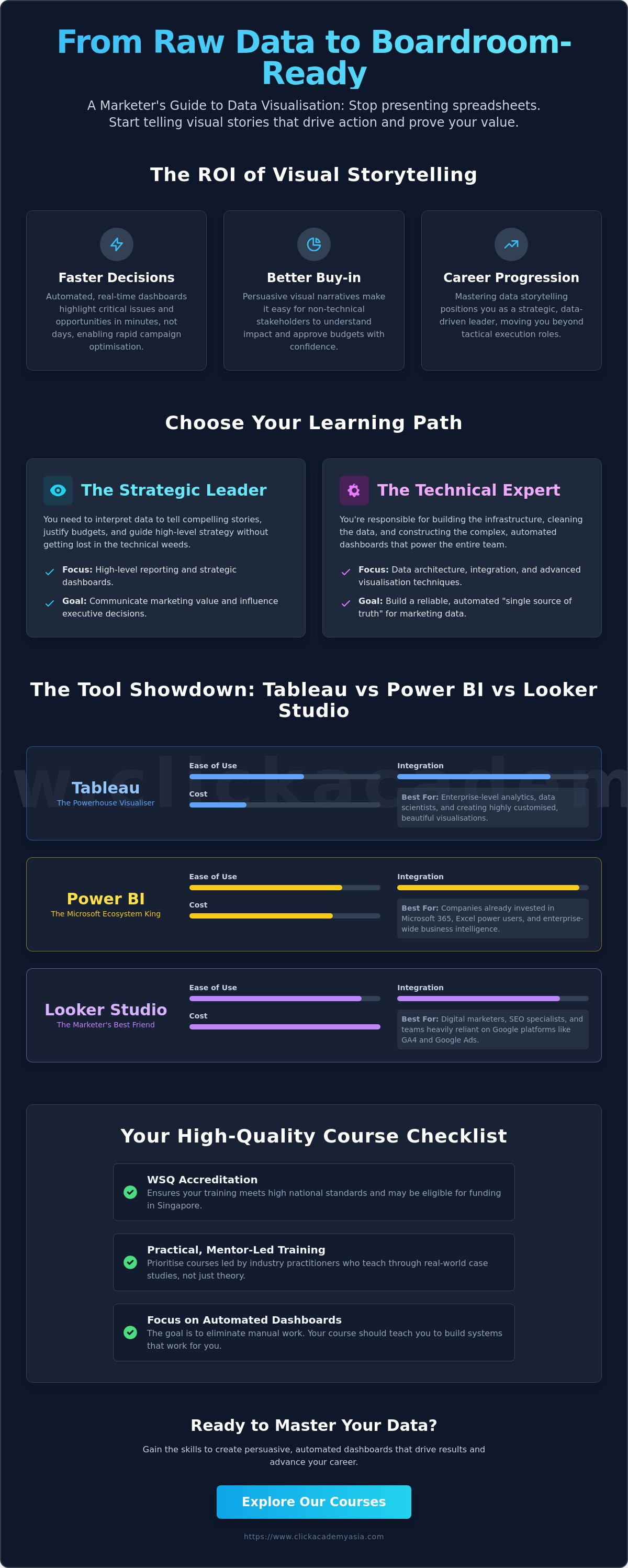
Comparing the Big Three: Tableau, Power BI, and Looker Studio
Choosing the right software often feels like a high-stakes decision; you don't want to master a tool only to find it doesn't play well with your existing tech stack. While a marketing data visualization course will teach you the universal principles of design, the specific software you choose dictates your daily workflow. In 2026, the market remains dominated by three titans, each offering a distinct approach to how we interpret and present marketing performance.
Tableau remains the gold standard for those who prioritise deep, complex data exploration and high-end design. It's the "Ferrari" of the group, offering unparalleled flexibility for creating bespoke dashboards that follow best practices for data visualization. However, this power comes with a price; as of May 2026, a Tableau Creator license costs $75 per user monthly. It's an investment best suited for dedicated analysts who need to slice data in a thousand different ways.
If your organisation is already deeply embedded in the Microsoft ecosystem, Power BI is often the most logical choice. It integrates seamlessly with Excel and Teams, making it easier to share insights across the company. At approximately $14 per user monthly for the Pro version, it's a cost-effective solution for large teams. A 20-person team can get up and running for about $2,400 per year, which is significantly lower than the entry point for Tableau's creator tier.
For digital marketers focused on web performance, Looker Studio is the essential tool for marketing analytics with GA4. The standard version is free, while the Pro tier costs $9 per user per month. It's the most accessible "entry point" for those taking their first marketing data visualization course because it connects natively to Google Ads and BigQuery without requiring complex third-party connectors.
Which Tool Suits Your Marketing Tech Stack?
Before committing to a tool, check its native integrations. You need to know if it connects directly to Meta, LinkedIn, and your CRM without incurring extra costs for third-party bridges. Some connectors can cost between $19 and $500 monthly, which can quickly eclipse your software license fees. You should also consider how easily you can share dashboards; Looker Studio excels at quick client sharing, while Power BI offers robust security for internal enterprise environments.
The Rise of AI-Assisted Visualization in 2026
Modern courses are now incorporating AI to streamline the design process. Tools have introduced features like "Tableau+" that use Natural Language Processing to let you query your data using simple English. Instead of building a chart from scratch, you can simply ask, "What was our ROI by channel last month?" While AI can suggest the best chart types, human oversight is still vital to avoid "hallucinated" insights that look pretty but represent incorrect data points.
How to Evaluate a High-Quality Marketing Data Visualization Course
Selecting a marketing data visualization course is a significant investment in your professional future. You shouldn't just look for a class that teaches you where the buttons are in a specific software. Instead, prioritize a curriculum that focuses on the "why" behind the visuals. A high-quality course will empower you to bridge the gap between complex analytics and executive-level persuasion. It should transform you into a storyteller who can command a room.
Start your evaluation by checking for WSQ accreditation. This ensures the course meets the rigorous standards set by SSG and remains relevant to the current needs of the Singapore workforce. You should also investigate the trainers' backgrounds. Are they career academics, or are they industry practitioners who have faced real-world marketing challenges? Practical experience is the only way to learn how to handle messy, real-world datasets that don't always fit into perfect templates.
Finally, look for a course that offers hands-on projects involving actual marketing data. If you're only practicing with generic retail sales figures, you'll struggle when it's time to visualize multi-channel attribution or social media engagement. If you're ready to advance your career with a recognised credential, explore our WSQ-certified marketing training programs to find your perfect fit.
The Importance of WSQ Certification in Singapore
In Singapore, WSQ courses are highly valued because they are strictly vetted for quality and industry alignment. Earning a WSQ certificate adds immediate weight to your LinkedIn profile and signals your competence to local employers. It's not just about the prestige; it's also about accessibility. Singapore Citizens and Permanent Residents can often access substantial subsidies, sometimes covering up to 70% of the course fees, making elite upskilling much more affordable.
Practical Application: Beyond the Classroom
Theory only takes you so far. A truly effective marketing data visualization course must include a capstone project where you build a dashboard from scratch. This project serves as a vital portfolio piece for your next promotion or job interview. It proves you can handle the end-to-end process of data cleaning, analysis, and visual design. Peer review sessions are also a hallmark of great training, as they provide the expert feedback needed to refine your visual style and clarity.
Standardised Quality: WSQ modules ensure you're learning skills that the industry actually demands right now.
Real-World Wins: Capstone projects allow you to solve actual marketing problems before you finish the course.
Networking: High-quality courses connect you with a community of like-minded professionals in Singapore.
Master Your Future with ClickAcademy Asia’s Professional Training
Choosing the right marketing data visualization course is the final step in moving from a tactical role to a strategic leadership position. At ClickAcademy Asia, we pride ourselves on being the premier destination for marketing-led data education in Singapore. We don't just teach you how to use a tool; we teach you how to think like a strategist who uses data to win.
Our mentor-led approach ensures that you focus on practical wins that you can apply to your job the very next day. We've stripped away the theoretical fluff found in many academic programs to focus on what actually moves the needle for your business. Whether you're building automated dashboards or presenting to the board, our training is designed to give you an immediate competitive edge.
One of our unique strengths is how our visualisation training integrates with other WSQ modules. You can stack your skills by pairing this course with our WSQ Search Engine Optimisation (SEO), WSQ Search Engine Marketing (SEM), or WSQ Content Marketing Strategy programs. This holistic approach ensures that your data stories are grounded in a deep understanding of every digital channel, addressing the common gap where technical skills aren't aligned with marketing frameworks.
Why Marketing Professionals Choose ClickAcademy Asia
We focus on "future-ready" skills that are specifically tailored for the 2026 digital landscape. Our learners join a prestigious network of professionals spanning across 30 countries, providing a global perspective on local challenges. Our "Supportive Mentor" philosophy means we're invested in your tangible career growth, providing the guidance you need to navigate a complex technological world with total confidence.
Industry Practitioners: Learn from experts who actually run campaigns and manage real-world marketing data.
Global Network: Connect with a community of high-achieving professionals from around the world.
Practical Focus: Every module is designed to solve a specific marketing problem, not just a technical one.
Next Steps: Transform Your Data into Strategy
The enrolment process is straightforward, and our team is ready to help you maximise your SkillsFuture credits to offset the cost. You can view our upcoming course schedule at ClickAcademy Asia to find a date that suits your professional timeline. If you're looking to upskill an entire department, we also offer custom corporate training tailored to your team's specific objectives.
Don't just report data; optimise it for success. Secure your spot in our next marketing data visualization course and start turning your metrics into a powerful engine for strategic growth. It's time to lead with clarity and command the respect your insights deserve.
Secure Your Competitive Edge with Strategic Visualisation
Mastering the art of data storytelling is no longer a luxury; it's a necessity for any marketer who wants to prove their impact. By choosing the right marketing data visualization course, you move beyond basic charts to create automated, beautiful dashboards that stakeholders actually understand. You've seen how tools like Tableau and Power BI can transform your workflow, provided you have the strategic foundation to use them effectively.
Your path to leadership is paved with practical, mentor-led training that bridges the gap between raw metrics and business growth. We've helped professionals from over 30 countries achieve their goals through WSQ-certified modules that are both rigorous and accessible. With government-subsidised training via SSG, high-level expertise in Singapore is within your reach. It's time to stop wrestling with spreadsheets and start leading with insights.
Empower your career; explore our WSQ Marketing Analytics & Insights course today!
We're here to support you as you navigate this technological shift and future-proof your career. You have the data; now it's time to give it a voice. We look forward to seeing you in the classroom.
Frequently Asked Questions
Is a marketing data visualization course worth it for beginners?
Yes, a marketing data visualization course is highly valuable for beginners because it builds the confidence needed to present data-driven insights. Instead of feeling overwhelmed by numbers, you'll learn the psychological principles of design that make your reports stand out. It's the fastest way to stop manual reporting and start providing strategic value to your organisation.
What is the best data visualization tool for marketers in 2026?
There isn't a single "best" tool; the right choice depends on your existing tech stack and budget. Looker Studio is excellent for teams prioritising GA4 and Google Ads, while Power BI is the logical choice for Microsoft-centric environments. If your goal is high-end, complex storytelling with beautiful design, Tableau remains the industry gold standard.
Can I use SkillsFuture credits for a marketing data visualization course?
Yes, Singapore Citizens and Permanent Residents can typically use their SkillsFuture credits for a WSQ-certified marketing data visualization course. These programs are vetted by SSG for quality and industry relevance. Eligible individuals can also access substantial subsidies, which can cover up to 70% of the full course fees depending on your specific eligibility criteria.
Do I need to know how to code to learn data visualization?
You don't need to know how to code to master these skills. Modern tools like Power BI and Looker Studio are designed for a "no-code" or "low-code" experience, focusing on drag-and-drop functionality. The real challenge isn't the technical syntax; it's learning the logic of data storytelling and how to choose the right chart for the right audience.
How long does it take to complete a WSQ-certified visualization course?
Most WSQ-certified modules are designed as intensive, two-day training sessions. This structure allows busy professionals to upskill quickly without taking extended leave from their roles. You'll complete a practical assessment during this time, ensuring you walk away with a recognised credential and a portfolio piece you can immediately share on LinkedIn.
What is the difference between data analytics and data visualization?
Data analytics is the process of examining raw datasets to find trends and answer specific business questions. Data visualisation is the art of communicating those findings through visual elements like charts and maps. Think of analytics as the research phase and visualisation as the persuasive presentation that drives executive buy-in.
Will this course help me with GA4 reporting?
Absolutely. A marketing data visualization course is specifically designed to help you make sense of the dense data structures found in GA4. You'll learn how to pull raw metrics into automated dashboards that highlight key performance indicators rather than just listing clicks. This transforms your reporting from a passive list of numbers into a strategic roadmap.
What career roles benefit most from marketing data visualization skills?
Digital marketing managers, SEO specialists, and data analysts benefit the most from these skills. However, anyone who needs to justify marketing spend to stakeholders will find these techniques life-changing. Whether you're in a small agency or a large multinational in Singapore, the ability to visualise ROI is a major driver for career progression.


Comments