Data Visualisation and Storytelling for Marketers: The 2026 Strategic Guide
- ClickAcademy Asia

- May 2
- 12 min read
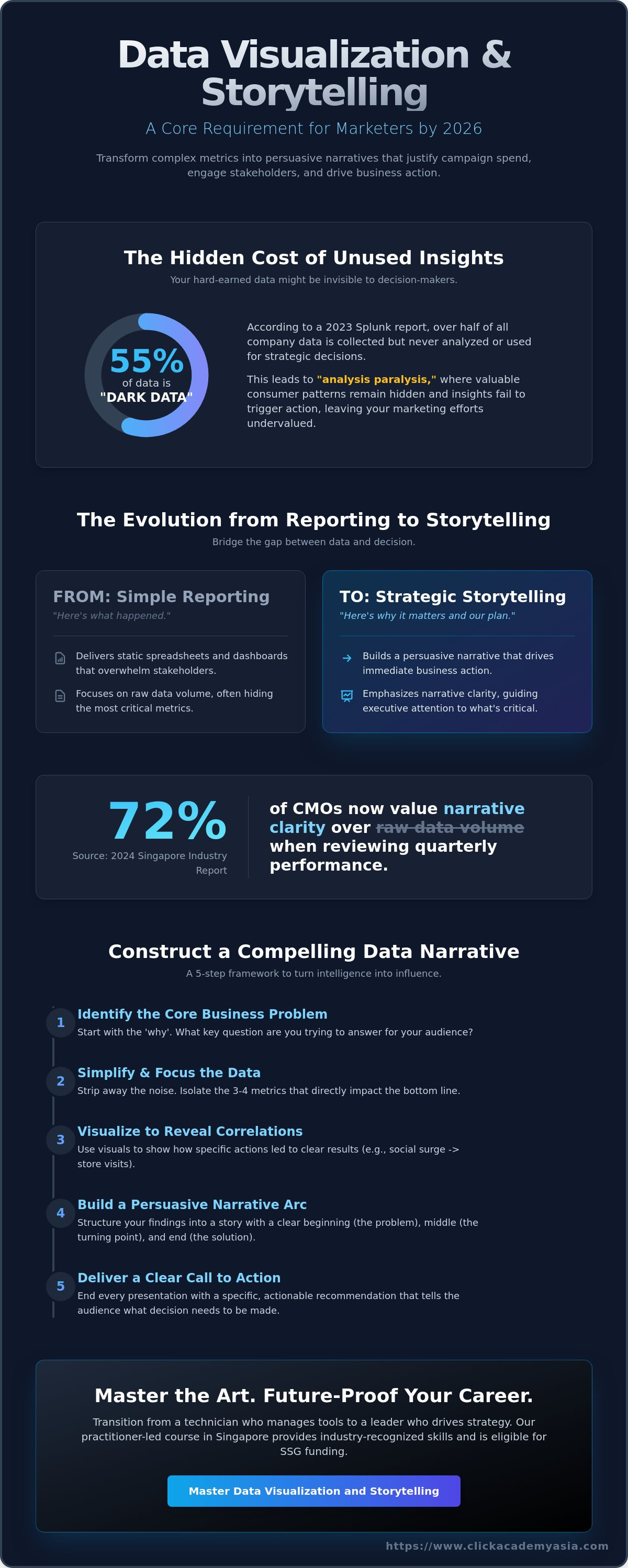
According to a 2023 Splunk report, 55% of an organisation's data remains 'dark data' that is never analysed or used to drive strategy. You've likely felt this burden while staring at a spreadsheet of 10,000 rows, wondering why your CMO just skimmed the summary page. It's frustrating when your hard-earned insights are met with blank stares during board meetings. To bridge this gap, mastering Data Visualization and Storytelling for Marketers - https://www.clickacademyasia.com/course/data-visualisation-and-storytelling is no longer a luxury; it's a core requirement for 2026.
We understand that "analysis paralysis" is real, especially when you don't have a background in technical tools like R or Python. You want your reports to trigger action, not just occupy space in an inbox. This strategic guide promises to help you transform complex metrics into persuasive narratives that justify your campaign spend and boost ROI. We'll explore how to build interactive dashboards that stakeholders actually use, identify hidden consumer patterns, and secure professional certification through WSQ-funded programmes in Singapore.
Key Takeaways
Distinguish between simple reporting and strategic storytelling to ensure your data reveals clear patterns and drives immediate business action.
Apply graphic design principles like visual hierarchy and strategic colour usage to direct executive attention to the most critical marketing performance metrics.
Master Data Visualization and Storytelling for Marketers - https://www.clickacademyasia.com/course/data-visualisation-and-storytelling to transition from static dashboards to interactive, code-driven visual elements that engage stakeholders.
Implement a five-step narrative framework to identify core business problems and transform marketing intelligence into a persuasive "turning point" for your audience.
Access practitioner-led training in Singapore and learn how to utilise SSG funding to offset costs while gaining industry-recognised skills that future-proof your career.
Table of Contents What is Data Visualisation and Storytelling for Marketers? Graphic Design Principles for High-Impact Marketing Visuals Evaluating Tools: From Interactive Dashboards to Source Code Constructing a Compelling Data Narrative: A 5-Step Framework Master the Art: WSQ Data Visualisation and Storytelling for Marketers
What is Data Visualisation and Storytelling for Marketers?
Marketers in Singapore often find themselves buried under mountains of campaign data without a clear way to present it to stakeholders. Data and information visualization is the practice of converting these raw numbers into graphical formats to reveal hidden patterns. It's no longer enough to just show a graph; by 2026, the industry expects you to go beyond simple reporting and move into the realm of strategic influence. This is where mastering Data Visualization and Storytelling for Marketers - https://www.clickacademyasia.com/course/data-visualisation-and-storytelling becomes a vital skill for your career progression.
To better understand this concept, watch this helpful video:
While reporting tells you what happened in the past, storytelling explains why it happened and what you should do next. Static spreadsheets are becoming obsolete in a landscape that demands real-time, interactive insights. If you want to bridge the communication gap with C-suite executives, you must translate technical metrics into a business narrative that justifies marketing spend. A 2024 industry report indicated that 72% of Singaporean CMOs now value narrative clarity over raw data volume when reviewing quarterly performances.
The Evolution of Marketing Intelligence
The shift from "big data" to "thick data" means that marketers must now account for the human context behind the numbers. Thick data focuses on qualitative insights that explain consumer emotions and motivations, which requires a much stronger narrative approach than traditional analytics. Data storytelling is the intersection of data, visuals, and narrative.
Professional development in this area is no longer optional for those aiming for leadership roles in Singapore. As the SSG and WSG frameworks continue to emphasise digital transformation, the ability to synthesise complex information into a persuasive story is a key differentiator. It marks the transition from being a technician who manages tools to a leader who drives business strategy.
Core Objectives of a Data-Driven Narrative
Your primary goal is to simplify complex datasets without losing the critical nuances that ensure accuracy. When you present a narrative, you are looking for specific correlations between campaign activities and changes in consumer behaviour. This helps your team understand which levers to pull to improve ROI.
Simplification: Stripping away the noise to focus on the 3 or 4 metrics that actually impact the bottom line.
Correlation: Using visuals to show how a specific social media surge directly led to an increase in offline store visits in Orchard Road.
Action: Every data presentation you deliver must include a clear call to action that tells the audience exactly what decision needs to be made.
By adopting the techniques found in Data Visualization and Storytelling for Marketers - https://www.clickacademyasia.com/course/data-visualisation-and-storytelling, you ensure that your insights don't just sit in a deck, but actually lead to tangible business growth. You can learn more about these strategies at ClickAcademy Asia, where we focus on practitioner-led training for the modern professional.
Graphic Design Principles for High-Impact Marketing Visuals
Raw data is often messy and overwhelming. Without clear design principles, even the most critical marketing insights get lost in a sea of spreadsheets. Effective Data Visualization and Storytelling for Marketers requires a shift from simply presenting numbers to designing experiences that lead to immediate action. By applying core graphic design rules, you transform a confusing chart into a persuasive narrative that justifies your budget and strategy.
The goal is to reduce cognitive load. This is the amount of mental effort required to process information. Research from MIT suggests the human brain can identify images seen for as little as 13 milliseconds. If your report takes minutes to decipher, you've already lost your audience. Stripping away "chart junk", such as unnecessary gridlines, 3D effects, and redundant labels, allows the data to breathe and the message to shine through.
Mastering Visual Hierarchy and Focus
Visual hierarchy is the arrangement of elements to imply importance. In a marketing dashboard, you should use size and position to guide the viewer’s eye. Place your primary KPI, such as a S$50,000 increase in monthly recurring revenue, in the top-left corner. This follows the natural "F-pattern" reading habit common in digital environments.
Leverage pre-attentive attributes like orientation, width, and enclosure to make data instantly understandable. These are visual cues our brains process before we even consciously think about them. For instance, a single bright bar in a muted grey bar chart immediately draws focus to a specific campaign's performance. Choosing the right chart type is equally vital; use line charts for trends over time and scatter plots to show the relationship between two variables, such as ad spend versus conversion rate. If you want to refine these technical skills, consider looking into practitioner-led training to bridge the gap between theory and execution.
The Psychology of Colour in Data Storytelling
Colour is a powerful tool for signaling performance and building brand trust. A consistent colour palette ensures visual continuity across monthly reports, making them look professional and authoritative. However, avoid the trap of overusing bright colours. Too many high-contrast shades compete for attention and create "visual noise" that distracts from the actual metrics.
Use colour strategically to indicate states: green for growth, red for alerts, and neutral tones for background context. This creates an intuitive "stoplight" system that stakeholders can read at a glance. When analysing customer journey data, use a single contrasting colour to highlight outliers, such as a sudden 25% drop-off at the checkout stage, to prompt immediate investigation. When you master Data Visualization and Storytelling for Marketers, you stop being a reporter of history and start becoming a driver of future strategy.
Typography and whitespace are your final tools for clarity. Use sans-serif fonts for digital reports to improve legibility on screens. Whitespace isn't "empty" space; it's a structural element that separates different data stories and prevents the viewer from feeling crowded. By giving your visuals room to breathe, you ensure your marketing insights are not just seen, but understood and acted upon.
Evaluating Tools: From Interactive Dashboards to Source Code
Selecting your toolkit is the most critical decision in your reporting strategy. While standard tools like Google Looker Studio or Tableau provide a solid foundation, they often hit a ceiling when you need to merge complex datasets. Mastering Data Visualization and Storytelling for Marketers is no longer optional; it is the primary way to secure buy-in for your 2026 budget. Effective storytelling requires a blend of quantitative metrics, such as a S$10,000 increase in ROAS, and qualitative insights from customer sentiment analysis. By establishing clear data hierarchies, you can organise information from five different social channels into a single, cohesive narrative that highlights what truly drives growth.
Interactive Dashboards vs. Static Reports
Static reports are post-mortems; interactive dashboards are living strategies. When stakeholders can filter by region or date, they stop being passive observers and start taking ownership of the results. You can build responsive visualisations that track real-time campaign performance, allowing your team to pivot spend before a budget is wasted. This interactivity fosters a culture of data-driven curiosity. For those looking to master the broader landscape of digital tools and analytics context, ClickAcademy Asia offers comprehensive resources to help you stay ahead of the curve.
The Marketer’s Guide to R and Python
Learning basic coding is the "unfair advantage" for the modern marketing professional. You don't need to be a software engineer to edit source code. Small tweaks in R or Python allow you to create clickable, bespoke elements that standard "drag-and-drop" tools simply cannot replicate. This level of customisation helps you translate complex Data Visualization and Storytelling for Marketers concepts into functional assets. Using programming to automate repetitive tasks ensures your reports are always up to date without manual intervention.
Automate repetitive tasks: Stop spending six hours every Monday manually updating Excel sheets or CSV exports.
Enhance storytelling: Use libraries like Ggplot2 or Plotly to create charts that highlight specific anomalies in your conversion funnel.
Scale your insights: Write a script once and apply it across every client or product line instantly, ensuring consistency in your reporting hierarchy.
Editing source code gives you total control over how your data looks and behaves. This technical edge ensures your visualisations aren't just pretty pictures but functional tools that accelerate decision-making across your entire organisation. By bridging the gap between raw data and actionable insights, you position yourself as a vital partner in your company's strategic growth.
Constructing a Compelling Data Narrative: A 5-Step Framework
Raw data is like a library of unread books; it contains immense potential but offers no value until someone reads the story. To move a room of stakeholders, you must transform spreadsheets into a structured narrative. Start by identifying the villain of your story. This is the core business problem, such as a 12% increase in customer acquisition cost or a stagnant engagement rate on social channels. Once the enemy is clear, gather marketing intelligence to find the turning point, the specific moment or insight where the data suggests a change in strategy is required.
Effective Data Visualization and Storytelling for Marketers - https://www.clickacademyasia.com/course/data-visualisation-and-storytelling requires selecting visual evidence that supports your primary argument without cluttering the message. Layer qualitative stories, such as direct customer feedback from a recent survey, over your quantitative stats to create emotional resonance. Finally, present a data-backed solution. This isn't just a suggestion; it's a clear path forward that leads to a specific business decision, like reallocating S$10,000 from underperforming display ads to high-intent search terms.
Finding the "Why" Behind the Numbers
Anomalies in your data are often the loudest signals of new marketing opportunities. If you notice a sudden 20% spike in traffic from a specific district like Jurong East, don't just record it; investigate the cause. You must contextualise this data within current Singapore market trends, such as shifting consumer habits during the Great Singapore Sale or changes in local GST regulations. To ensure your insights land well, simplify them based on your audience. A CMO needs the strategic "so what," while a digital specialist requires the granular "how-to" for execution.
Blending Statistics with Customer Experiences
Numbers tell you what is happening, but qualitative insights tell you why. Creating a holistic narrative means humanising hard data. Instead of reporting a 15% bounce rate, describe it as 150 potential customers walking into your shop and leaving because they couldn't find the price tag. This approach allows you to evaluate marketing campaign performance with much higher accuracy. It moves the conversation from abstract percentages to real-world friction points that need solving.
Consider a case study where a local e-commerce brand saw conversion rates drop from 4.2% to 2.1% over a single weekend. The data showed the drop, but the story was found in user session recordings. Customers were frustrated by a new, mandatory account creation step that added three minutes to the checkout process. By framing the data as a story about user experience friction rather than just a "bad KPI," the marketing team secured immediate approval to revert the change, restoring revenue within 24 hours.
To lead your team through complex digital shifts, you need to master these narrative techniques through practitioner-led training.
Master the Art: WSQ Data Visualisation and Storytelling for Marketers
Data is just noise without a narrative. While many professionals can generate a report, few can translate complex metrics into a compelling business case that drives action. The Data Visualization and Storytelling for Marketers course at ClickAcademy Asia is designed to bridge this specific skill gap. This practitioner-led programme moves beyond basic chart creation to focus on the psychology of visual persuasion and strategic communication.
You'll learn to identify the most effective visual formats for different stakeholder groups, ensuring your insights resonate with both technical teams and C-suite executives. By the end of the sessions, you'll be able to build data-driven stories that don't just inform, but actually influence decision-making. The curriculum is built on real-world applications, meaning you can apply these techniques to your next campaign review or board presentation immediately.
Why Choose a WSQ-Accredited Course?
In the competitive Singapore job market, WSQ (Workforce Skills Qualifications) certifications serve as a powerful benchmark for professional competence. This course is mapped to the WSQ Digital Marketing Strategy & Planning framework, ensuring the content meets rigorous national standards. When you complete the Data Visualization and Storytelling for Marketers programme, you're not just getting a certificate of attendance. You're gaining an industry-recognised credential that proves your ability to handle data at a strategic level.
Standardised Excellence: Benefit from a curriculum vetted by SkillsFuture Singapore (SSG) for quality and relevance.
Portfolio Impact: Add a formal qualification to your LinkedIn profile that employers and recruiters actively look for.
Practical Assessment: Demonstrate your skills through hands-on projects rather than just theoretical exams.
Maximising Government Subsidies and Credits
Investing in your career shouldn't be a financial burden. Singaporean citizens and Permanent Residents can leverage significant SSG funding to offset a large portion of the course fees. For individual learners, your SkillsFuture Credit can be used to cover the remaining out-of-pocket costs, often resulting in minimal personal investment for high-value training. Companies can also benefit from generous grants when sponsoring employees, making it a cost-effective way to upskill entire marketing departments.
To ensure you're getting the best possible support, it's vital to check your eligibility for various funding tiers, such as the Mid-Career Enhanced Subsidy for those aged 40 and above. You can find a detailed breakdown of these financial options in our guide on Mastering the 2026 Landscape: WSQ Digital Marketing Courses in Singapore. Taking the time to verify your credits now ensures a smooth and affordable enrolment process.
Ready to transform your data into a strategic asset? Visit the ClickAcademy Asia website to view the upcoming intake dates and secure your spot. Preparing for the course is simple; just bring your current data challenges and a mindset ready for growth. Don't let your insights stay hidden in a spreadsheet when they could be shaping the future of your brand.
Transform Your Data into a Strategic Asset
Success in 2026 won't be defined by how much data you collect, but by how effectively you communicate its value. By mastering the 5-step narrative framework and applying high-impact design principles, you'll turn dry spreadsheets into persuasive visual stories that drive board-level decisions. It's about moving beyond basic charts to create interactive experiences that resonate with your target audience. This transition from analyst to storyteller is what defines modern marketing leadership.
As a leader in digital marketing education across the Red Dot region, ClickAcademy Asia provides the practical tools you need to excel. Our Data Visualization and Storytelling for Marketers - https://www.clickacademyasia.com/course/data-visualisation-and-storytelling course offers practitioner-led training using real-world marketing datasets. Singapore Citizens and PRs can benefit from up to 70-90% WSQ funding, making this an accessible path to professional mastery and career growth.
Don't let your insights get lost in translation. Take the next step to elevate your professional profile and lead your team with data-driven confidence. Master Data Storytelling – Enrol in the WSQ Course Today. We're excited to help you shape the future of your marketing impact and future-proof your skills.
Frequently Asked Questions
Is this Data Visualisation course suitable for marketers with no coding experience?
Yes, this course is designed specifically for marketers who prefer visual strategy over writing code. You'll focus on how to interpret data and build compelling narratives rather than mastering complex programming languages. Most participants come from creative or strategic backgrounds, so the curriculum prioritises user-friendly interfaces that allow you to transform raw numbers into actionable insights without typing a single line of script.
Can I use SkillsFuture Credit to pay for the Data Visualisation and Storytelling course?
You can definitely use your SkillsFuture Credit to offset the costs of this course. As a SSG approved programme, it's eligible for the opening S$500 credit and the subsequent top-ups provided to Singapore citizens aged 25 and above. This makes the Data Visualization and Storytelling for Marketers workshop highly accessible for professionals looking to upskill without a heavy out-of-pocket expense.
How much can I save with WSQ funding for this marketing analytics program?
Singapore citizens and Permanent Residents can save up to 70% of the course fee through WSQ funding. For a typical professional development programme, this reduces your investment significantly, often leaving only a small balance that can be covered by SkillsFuture Credit. If you're a Singapore citizen aged 40 or above, you qualify for the Mid-Career Enhanced Subsidy, which covers a larger portion of the costs to support your career growth.
What tools will I learn to use for data storytelling in this workshop?
You'll gain hands-on experience with industry-standard tools like Google Looker Studio, Tableau, and Microsoft Power BI. Instead of just learning where to click, you'll master how to choose the right chart type for your specific marketing KPIs. Our practitioner-led sessions ensure you understand how to connect these tools to live data sources like Meta Ads or Google Analytics 4 to create real-time dashboards that impress stakeholders.
What happens if I have never used R or Python before joining the course?
Don't worry if you've never touched R or Python, as they aren't required for this workshop. We focus on "no-code" and "low-code" solutions that are more practical for the daily workflow of a busy marketing manager. You'll find that modern Data Visualization and Storytelling for Marketers tools are intuitive enough to learn in a single session, allowing you to produce professional-grade reports immediately without any technical background.
How long does it take to see an ROI from learning data visualisation skills?
Most students see a return on their time investment within 30 days of completing the workshop. By automating your monthly reporting and presenting clearer insights to your team, you can save roughly 5 to 10 hours of manual data crunching every month. This efficiency allows you to spend more time on strategy and execution, which directly impacts your campaign performance and your value within the organisation.


Comments